


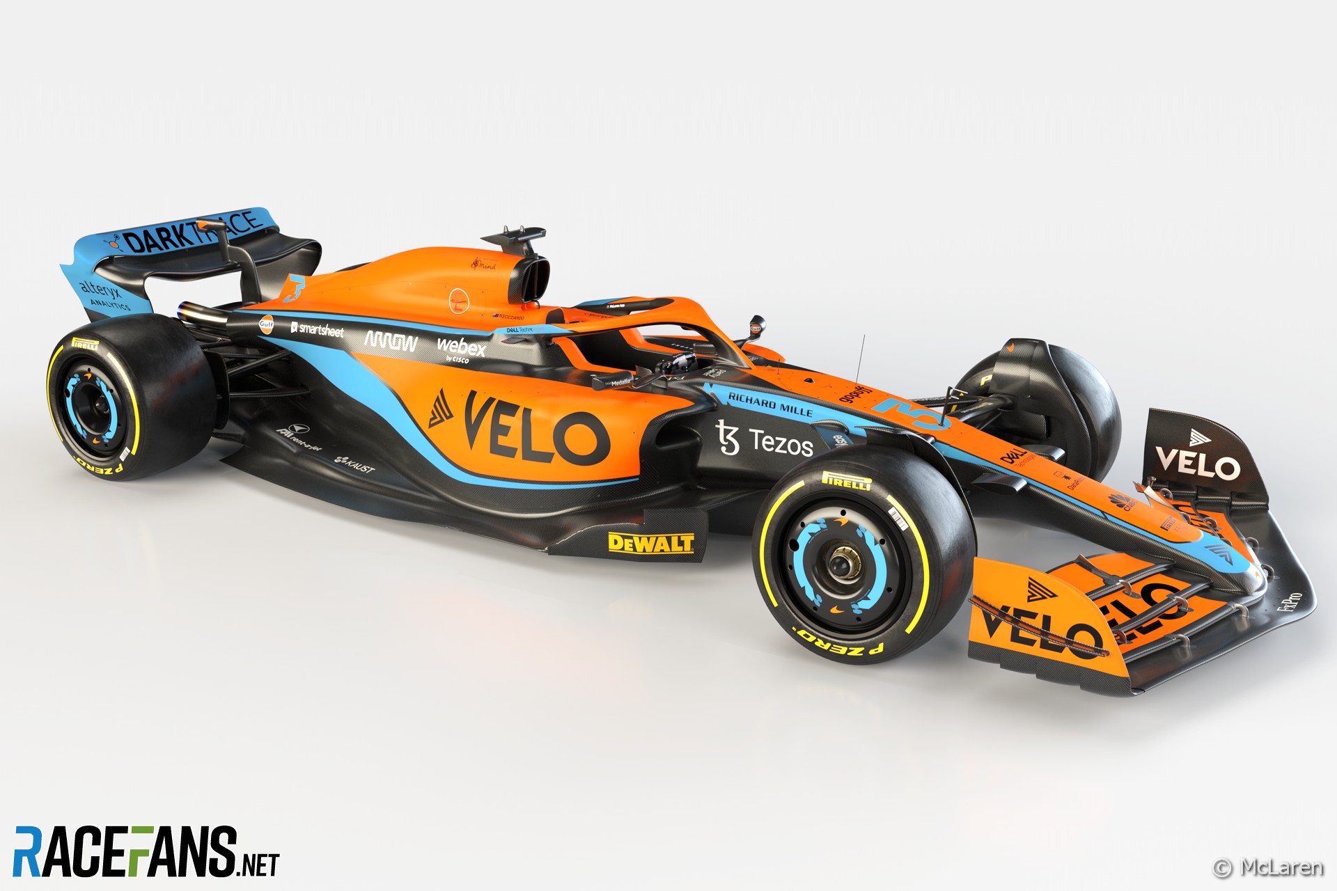
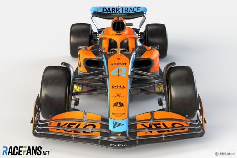
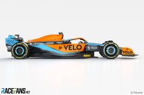
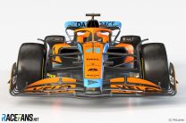
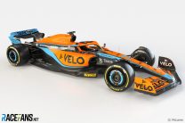
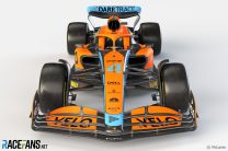
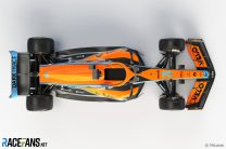
McLaren has presented its new Formula 1 car for the 2022 season in an eye-catching new livery which echoes its popular one-off design from last year’s Monaco Grand Prix.
The team revealed its MCL36, which will be raced by Lando Norris and Daniel Ricciardo, in an online event. It also presented the complementary liveries which will be used by its IndyCar team McLaren SP and its new Extreme E entry.McLaren is the second F1 team, after Aston Martin, to present its genuine 2022 contender: Haas revealed renderings of its VF-22 while Red Bull displayed a show car painted in its new livery.
The 10 F1 teams have had to tackle a significantly revised technical rule book for 2022 which has resulted in cars which look very different to last year’s designs. F1 intends its new rules will make it easier for drivers to follow each other closely and reduce the performance gaps between teams.
“After a couple of months away from racing, all of us at McLaren are excited to get back to the track and discover this new era of Formula 1 regulations head-on,” said team principal Andreas Seidl. “Over the last year the team have been hard at work developing the MCL36, seeking to take advantage of any opportunities we might find in the design and production of these new cars.
McLaren finished fourth in the championship last season, one place lower than it managed the season before, despite continuing to increase its points haul again. Ricciardo led a one-two for the team in Monaco, ending McLaren’s nine-year wait for a grand prix victory.
Seidl expects the team to continue its progress this year. “Our objective for this season is clear and consistent with that of previous years: we want to further close the gap to the front of the pack.
“At the same time, we know and respect the tough competition we’ll face and have a realistic view of where we are on our journey. We’re working through a package of key infrastructure investments, which will provide us with the tools required to compete at the top of our sport when they come on-line.”

“I’m excited to see Lando and Daniel get behind the wheel of the MCL36 and take it to the competition this year,” Brown continued. “Lando made great progress in 2021, scoring four podiums, and Daniel’s sensational victory in Monza reminded the team what it feels like to win again.
“As we head into 2022, we’re looking to build on that progress and further close the gap to the teams at the front.”
Earlier this week McLaren announced it had extended the contract of Ricciardo’s team mate, Lando Norris, who will remain with the team until at least the end of 2025.
Pictures: 2022 McLaren MCL36


This article will be updated
Advert | Become a RaceFans supporter and
2022 F1 season
- Verdict on error in GT race suggests Mercedes would have lost 2021 Abu Dhabi GP appeal
- Title ‘stolen’ from Mercedes made us ‘underdogs people cheer for’ – Wolff
- Red Bull Racing spent £230m during Verstappen’s title-winning 2021 campaign
- ‘I can’t box?’: Hamilton and Verstappen’s 2021 Abu Dhabi GP radio transcript
- Abu Dhabi’s legacy one year on: How the controversial 2021 finale changed F1
Sonny Crockett (@sonnycrockett)
11th February 2022, 19:35
Amazing!
elchinero (@elchinero)
11th February 2022, 20:56
With a nod to “Gulf”. Kudos. Laurels. Plaudits.
Robbie (@robbie)
11th February 2022, 22:12
I really like it too.
GeeMac (@geemac)
14th February 2022, 3:49
I must be showing my age because it looks like an awful mess to me…
Qeki (@qeki)
11th February 2022, 19:35
It’s a bit of a mess.
That VELO stands out a lot
hunocsi (@hunocsi)
11th February 2022, 19:41
Yeah, it’s patched up, I’m not a big fan. Too much black for me as well.
Olivier
11th February 2022, 19:46
I agree. And why have the black line run across the whole car?
My livery ranking so far,
Red Bull: 8/10
Haas: 6/10
Mclaren: 4/10
Aston Martin: 3/10
G
11th February 2022, 20:37
Really? I think the Aston is the best yet and will be hard to beat.
OOliver
11th February 2022, 20:42
I agree. The Aston so far has the action look. Unless green is not to everyones taste, that look will be hard to beat.
mauro (@maurob)
11th February 2022, 20:52
agree – Aston more innovative … could be more difficult as setup, but aggressive …
Olivier
11th February 2022, 22:33
I gave it a 3 because the colour scheme is a mess: (1) White sponsor stickers are all over the car while (2) the Aston Martin logos are yellow, and (3) the back of the wing of their car has a blue gradient from one of their main sponsors.
Robbie (@robbie)
11th February 2022, 19:54
@qeki I’m sure VELO will be thrilled to hear that.
Renee (@renee)
12th February 2022, 0:56
I agree, first livery in years that just grabs your attention. Looks really good and modern.
Also, sorry for going off-topic but… what the hell is up with the galleries on this page? I’ve been asking it for years all ready, but it’s still the same. It’s so broken. Opening the first picture in the gallery and then going through it, clicking on the “next picture” jumps around in the order and more often than not, completely skips several pictures. How is it still possible to be using such a broken system? Awful.
Mark
12th February 2022, 14:07
I agree about the gallery, I always wondered if I was the only one that find that gallery navigation annoying. It will be a great upgrade for the site.
eljueta (@eljueta)
11th February 2022, 19:36
I’m calling it, best looking livery
Sonny Crockett (@sonnycrockett)
11th February 2022, 19:37
When you see the camera run over it, it’s fantastic.
Mashiat (@mashiat)
11th February 2022, 19:40
I like it. Interesting that they have gone down the pull-rod front suspension route as Ferrari has been rumored to do.
Ruben
11th February 2022, 19:40
What I don’t understand, but seems to be a trend these days, is that it all seems to be ‘patches of colour’ on a bare carbon car, rather than having the entire car painted.
Mr David Dewis (@davehaslanded)
11th February 2022, 19:44
I personally like the bare carbon look. Plus paint adds weight. But it’s obviously too dark for some sponsors, which is why it ends up a patchwork.
Ruben
11th February 2022, 19:57
Yes and then there’s black lines between the orange and the blue too. I don’t mind the bare carbon, but it would be nicer (easier on the eye) if any painted parts weren’t subtly subdivided by more carbon.
MSO
11th February 2022, 19:45
Weight.
Qeki (@qeki)
11th February 2022, 19:41
James Key doesn’t look James Key anymore with those facial hairs
Ben
11th February 2022, 19:41
Fantastic. Finally a team who actually design a livery rather than a base colour and a few lines. Some really smart work put into this one and those colours are just incredible. Best car so far by an absolute mile. I knew there’s a reason why I love McLaren.
theRealMax (@millionus)
11th February 2022, 19:42
Nice to see some variation on the wheel coverings
Mr David Dewis (@davehaslanded)
11th February 2022, 19:46
That’s one part of the car that a lot seem to have neglected. Early tenders showed fake “alloys” painted on them. Then there was rumours of having a light display on them. Both of these appear to have been dropped.
Imre (@f1mre)
11th February 2022, 19:43
Genuine? Looks like it does not have DRS.
MSO
11th February 2022, 19:47
I’m watching the feed and this one definitely does
Robbie (@robbie)
11th February 2022, 19:56
@f1mre So probably not their actual rear wing then.
bernasaurus (@bernasaurus)
11th February 2022, 19:45
I really do like the livery, but goodness that car looks big, I know Chandhok and Brown are exactly the biggest humans ever, but stood next to the car; the car looks the size of an aircraft carrier.
bernasaurus (@bernasaurus)
11th February 2022, 19:46
*aren’t the biggest humans ever.
nandy
11th February 2022, 19:55
The secondary goal after overtaking should have been to reduce the length back to early 2000 sizes. They missed a trick not doing so.
mmertens (@mmertens)
12th February 2022, 2:21
True, they should reduce wheelbase distance with new regs, at least 30cm. Powertrain as it is now will probably not allow this to happen.
Qeki (@qeki)
11th February 2022, 19:52
@bernasaurus Those new tyres are making it look even bigger.
Renee (@renee)
12th February 2022, 1:04
It’s called perspective. The car is closer to the camera and they are standing some distance back from the car. and as we know objects closer to us appear much lager compared to objects farther away.
Also, as there are 4 people standing behind the car and it seems they could all stretch out their arms without touching hands, the car would have to be nearly 7m (275in) long, and I highly doubt that is the case lol.
CheeseBucket (@cheesebucket)
12th February 2022, 12:08
It’s smaller than last years car rofl, go use the slider on the interactive post.
Dan Rooke (@geekzilla9000)
11th February 2022, 19:46
Yes!!! It’s gorgeous I think, looks much better in the video than it does in still shots too. I think it’ll look great in track.
Looks fast, fingers crossed it is! :-D
hunocsi (@hunocsi)
11th February 2022, 19:47
Might be a silly question, but there are so many joints between the front wing and nose cone, and also with the end plate. Will these wings be harder to break off? And could any small, partial damage (like something that would have broken off the end plate only on old designs) have a bigger impact on the whole wing?
Bob (@mp4-bob)
11th February 2022, 22:23
@hunocsi
It’s not really a silly question. Firstly, I’m going to say with the strength of the wings, we’ll have to wait and find out during the season, we don’t know yet. However, I suspect they will be solely because all of the elements bar the bottom one are now connected to the nose cone directly, so they should be more strongly connected, and the bottom element which isn’t connected has a stronger connection through the end plate to the upper elements then the upper ones did to the bottom one in the previous regulations. However, we’ll have to find out.
As for all the smaller components, most of them are similar to what we had in previous years, although it wouldn’t surprise me if teams try to have as many as reasonably possible and have them a bit spikier compared to previous years. You would’ve noticed in the previous regulations, the upper elements didn’t connect to the nose. This created a vortex which is a very useful aerodynamic device, however, it hurts racing. That’s why these elements now connect to the nose, to remove said vortices and improve racing. However, teams will try and still develop these vortices elsewhere to improve their performance. On the Aston and this McLaren (as well as the Haas to a lesser extent) you can see they have this triangular component that just sticks out. Technically this is for when they adjust the wing, they can use this to help move the component up and down. However, the reason it’s so aggressive is to create those same vortices we no longer have. I suspect teams will try and do a similar this with some of the linkage components as well in certain areas, if in the race spec we get some of them that are more aggressive and form a line up the wing, that’d be the reason for it I’d imagine.
Anyway, sorry for rambling a bit but I hope that helps.
Pironi the Provocateur (@pironitheprovocateur)
11th February 2022, 19:48
I appreciate the change. However, the livery is a bit disproportional, especially at the rear. And I don’t believe we’ve seen anything more than the livery. McLaren, you’re not going to fool anyone.
Srdjan Mandic (@srga91)
11th February 2022, 19:48
Stunning livery! I like it even more than the Aston Martin.
Interesting design on the sidepod air intakes. Btw, third different design on the third car so far in that area. So much for all the cars looking the same this season.
Front wing looks similar to the AM and different to the Haas. But the sidepod design seems less ‘bulky’ than the AM and similar to the Haas.
thegamer23
11th February 2022, 19:51
Messy livery, looks like a backmarker car.
Thomas
13th February 2022, 10:08
Agree its a mess. Design for design’s sake. Hopefully it will go faster. Either way, Aston is miles classier.
Jere (@jerejj)
11th February 2022, 19:54
The best livery design thus far. I prefer this 3-color mix over the predominantly-orange recent past one.
Pironi the Provocateur (@pironitheprovocateur)
11th February 2022, 19:54
Arrows circa 2000, is that you?
Srdjan Mandic (@srga91)
11th February 2022, 19:58
My thoughts exactly. Now they just need to sign Max Verstappen to make it look perfect :)
Wellbalanced
11th February 2022, 20:27
Totally: https://www.unracedf1.com/wp-content/uploads/2018/11/images_Formule1_JosVerstappen2000-1300-x-852-1210×642.jpg
And I think the Aston looks quite 2003 Jaguar: https://cdn-1.motorsport.com/static/img/amp/100000/110000/113000/113900/113929/s6_27546/f1-jaguar-r4-launch-2003-the-new-jaguar-r4.jpg
SPIDERmaN (@spiderman)
11th February 2022, 20:01
This car looks muscular in its stance. I hope the performance matches its big look.
Darkich
11th February 2022, 20:05
To my layman eyes, Aston Martin looks DRAMATICALLY more advanced.
Just compare the basically flat side pod walls on McLaren with radically undercut ones on the Aston.
nick---0 (@nick-0)
12th February 2022, 18:19
You just have to wait for testing. One way could be better than the other, or they could be 2 solutions that produce the same end result. It’s impossible to say currently unless you have a team of aerodynamicists to talk to. It’s just wild speculation at this point.
Maybe the more forward sidepods on the Mclaren are the critical differentiator. Who knows. Once all the other cars are launched it’s easier to compare them. Say if only Aston has those type of sidepods after all the reveals then maybe that is more an indication of something. It will be interesting to see. Bring on the other launches! :-)
F1 frog (@f1frog)
11th February 2022, 20:18
After all the fear that the cars would all look the same, it’s nice to see how different the McLaren looks to the Aston Martin. It appears there is some room for innovation within the new rules.
Stash (@stash)
13th February 2022, 1:14
People have been saying that they do not wish it to become a spec’ series. It has been a spec’ series in many ways for a very long time. The real issue to me is to what degree. It’s always a balance. I’m more interested in whether or not the drivers can compete with each other closely because over many years now this does not seem to have been the case. Can they drive near each other? Can they drive in each others wake? Can they overtake each other without the need for artificial aids to achieve this. If they need artificial aids like DRS then the less reliance on this the better; I’m sure everyone feels the same. It’s all a balance. Like life. A balance. Is it all work and no play? Or is it sixty percent work and forty percent play? Or twenty percent work and eighty percent play? Finding the right balance. I wish people would stop going for absolutes in everything. Compromise. Engineers still have many things to play with. Is the balance right though? We will see. Let’s at least see some closer driving first. We want tussles. I want to see tussles. The tussle element has been suffering for too long now imo. Pretty hard for everyone to get there tussle time in when one engine manufacturer has been wiping the floor with everyone. The balance has been skewed in the engine department for far too long; almost to where it appears to be favouritism. So much so I think it is hurting Merecedes as a company to some degree. Let’s get the balance right. Maybe someone else can condense what I am trying to communicate in a better way to get the message across?
Niefer (@niefer)
11th February 2022, 20:24
Cool bodywork, horrendous livery. Ugh…
rpiian (@rpiian)
11th February 2022, 20:25
I’d say best looking so far. The long nose on the red bull and aston martin is hideous.
G
11th February 2022, 20:38
I’d love them to go back to their chrome, black and red. By far my favourite McLaren livery.
Becken Lima (@becken-lima)
11th February 2022, 20:49
Personally, I wont be so judgmental about the livery. I never liked the Gulf color scheme anyway. But in aero terms, the car looks the best and well sculptured so far.
Darkich
12th February 2022, 11:34
I totally disagree. The bodywork looks crude, there’s basically no undercut on the sidepods! Just compare the front views of Aston and this car, the Aston looks drastically more sculpted.
Also, the rear suspension makes no sense according to Gary Anderson
JFK
13th February 2022, 6:42
If Gary Anderson says so….))))
James Key knows what he is doing he has proved that he is better than Gary Anderson.
Neil (@neilosjames)
11th February 2022, 21:00
Love that one. My mind is telling me that, from a purely rational perspective, it should really be an ugly colour scheme, but… whole thing looks beautiful.
The Dolphins
11th February 2022, 21:20
I cannot get past these new wheels (or wheel covers.) Looks like they parked an F1 car in a dodgy area and someone nicked the wheels and swapped some spare ones from a boot.
erikje
11th February 2022, 23:08
Well, at least better then last season.
The livery from the side looks okay, the look from above is messy.
The rear wing looks suspicious, not a real one I guess.
So a combination of real and fake.
hahostolze (@hahostolze)
11th February 2022, 21:38
That’s literally an Indycar. I’m really digging it though.
Two cars shown, and they’re already absolutely different around key areas (like Coke bottle). Fascinating.
Djangles LeVaughn (@royal-spark)
11th February 2022, 21:48
The numbers on the car need to have black outlines. It’s making my eyes go funny.
Tommy C (@tommy-c)
11th February 2022, 22:21
Fantastic! Love it. Really my favourite of the new cars so far. Hard to top I reckon! Hopefully it goes as well as it looks.
Mr Fabulous (@mrfabulous)
11th February 2022, 22:37
Eeeuuuggghhhh……
:-(
ykiki5
11th February 2022, 22:42
Seems to be missing Coca-Cola this year.
Biggsy
11th February 2022, 23:22
The biggest indication that McLaren is an old and spent team, on their way out (or to mediocrity), is the fact that they are not shaping the future anymore, but reliving the past.
They are trying to earn legitimacy (in the eyes of fans and sponsors) by associating themselves with the McLaren of the glory days, instead of by taking the team to new successes worthy of its glorious past.
Darryn Smith (@darryn)
12th February 2022, 1:25
I don’t remember an orange Mclaren in the glory days? Seems they’ve got an American director like in the original glory days of the 70’s. This team has nothing to do with the one Bruce Mclaren started and a lot with Ron Dennis’s Project 4.
Tommy C (@tommy-c)
12th February 2022, 5:44
Does this logic apply to red Ferraris and silver Mercedes too? Or green Aston Martins? I could go on… but I won’t.
Fikri (@elangsawah)
11th February 2022, 23:35
Interesting that they went pull rod on front suspension and push rod on rear
The Dolphins
12th February 2022, 1:34
I will need to re-watch the launch video but at least from the angles available in the photos above the rear geometry looks to me as though it’s pull rod as well.
Mark (@blueruck)
11th February 2022, 23:41
I was wondering if the wheels were made standard this year and teams get to mess with the cover or are they each still producing their own wheels? Anyone know?
Ed
12th February 2022, 0:59
BBS now are the sole rim supplier to the entire grid, the wheel covers are a spec part also, my understanding is that they are the same on all cars but if they aren’t they are heavily regulated to make sure that teams can only adjust the cooling gaps to line up with their cooling solutions.
Zap (@)
11th February 2022, 23:41
Less aggressive sidepods than the Aston, no undercut, pull-rod suspension, different front wing (though still interesting geometry there), no louvres and nearly no coke-bottle. Can’t say they all look alike now, can we?
And I even like the color
Jason (@jasonj)
12th February 2022, 0:04
The VELO is way to large and seems misplaced. A truly great livery would have taken the initial sponsors logo sizing and allowed to fit within the scheme.
It shows though, all the money in the world won’t buy you taste or design sense.
PT
12th February 2022, 8:49
The whole livery lacks taste and design sense, a hotchpotch job. It was perfect last season. They replaced the beautiful blue of last season and replaced it with a much lighter blue, and there is too much black used. They needn’t have messed with last season’s design. The overall attractive design of the new F1 car regs make it slightly more palatable to the eye.
NS Biker (@rekibsn)
12th February 2022, 0:12
WOW … 50 comments before the first “Technical” posting. And who says “Looks Don’t Count.”?
All the wheels and the centers are manufactured to a standard design by BBS I believe. That’s BBS in Asia. So apart from a touch of paint, they will all be the same, or really close.
One of the big changes required for this year is the elimination of Barge Boards. So what is that set of aero apendages on the leading outer edges of the side-pods. Sure looks like a Barge Board.
Not doubting Fikri, but I couldn’t find anything that showed the rear push-rod suspension.
Layout Pull and Push is logical. Shocks and springs are a heavy component at the front, hence get them low. In the rear, loads of other heavier parts, no issue in fitting them high. Seems logical.
Phil Norman (@phil-f1-21)
12th February 2022, 1:02
I’m not keen to be honest. I think it’s a little boring. Too much black and just doesn’t inspire me. I think the Aston Martin is by far the most aesthetically pleasing so far.
This is 3rd or 4th.
PT
12th February 2022, 8:51
The Aston Martin AMR22 is the best, in terms of livery and the car shape too. Neat looking lines that blend well the green.
Capo
12th February 2022, 1:19
Lol I mean Monza
Mark Thomson (@melthom)
12th February 2022, 4:07
It’s the best so far and yet just a horrible mess.
David
12th February 2022, 5:14
Disgusting. So unbelievably easy to do amazingly well with the Gulf livery, and they completely messed it up. They just had to copy this: https://www.motorauthority.com/news/1121041_2019-ford-gt-heritage-edition-with-famous-gulf-livery-sells-for-2-5m
kpcart
12th February 2022, 5:52
I like it and hope it’s a race winner.
PT
12th February 2022, 8:53
@Keith, didn’t Ricciardo lead a McLaren 1-2 at Monza and not Monaco in 2021?
antybuc
12th February 2022, 11:00
The best so far. Kinda retro Gulf-like :)
just.daz (@nemo87)
12th February 2022, 12:16
I really wanted to like this, but I don’t.
It’s a mess! There’s a lot going on and it doesn’t look very McLaren at all in my eyes! Sad face.
Qeki (@qeki)
12th February 2022, 19:17
After seeing the overalls I was kinda hoping for a black Mclaren.. a blacklaren…
DB-C90 (@dbradock)
13th February 2022, 1:04
Personally I don’t care at all about livery. All I’m interested in is how it performs.