


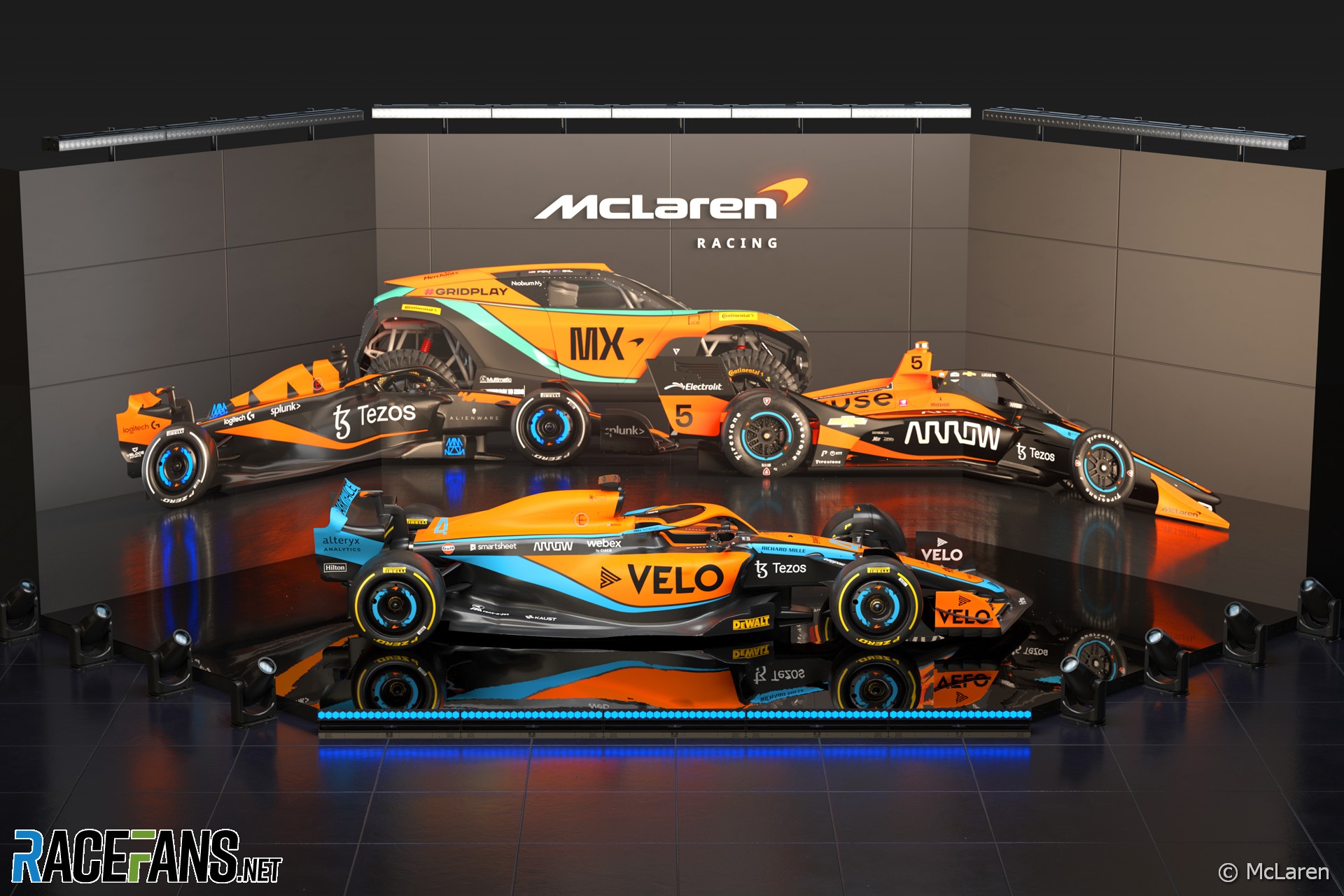
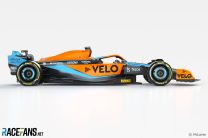
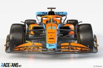
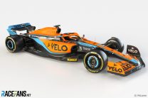
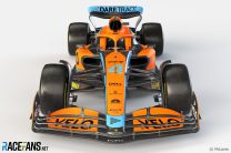
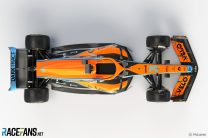
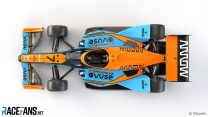
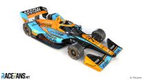
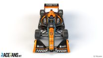
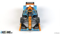
McLaren’s new look for its 2022 Formula 1 and IndyCar liveries came about due to the positive reaction to the special colour scheme it ran at last year’s Monaco Grand Prix.
The team ran a one-off Gulf livery in Monaco last year. It has adopted some of the colours from that car on its new contender for the 2022 F1 season.“We’ve been evolving our livery since we’ve gone back to papaya,” explained McLaren Racing CEO Zak Brown. “We wanted something that was very vibrant, changed the shade of our papaya, and it’s a darker blue.”
Gulf recently became the official ‘first-fill’ supplier of lubricants for McLaren’s road car division. But although the new F1 car makes greater use of their heritage colours, Brown confirmed the lubricants producer has “not increased their commitment to us”.
“The livery changes that we did last year, both in Monaco and Abu Dhabi, we got a lot of great fan reaction,” said Brown. “They like to see a lot of energy.
“I think it’s got some speed and elegance to it that we thought would go on top of the fast race car that hopefully we’ve designed this year. It’s just a natural evolution and then trying to make sure we give all of our partners good stand-out on the car. So I think it achieved all of the above.”
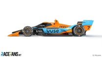
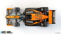
A similar look is applied across the rest of McLaren’s IndyCar, Extreme E and Esports competition cars. In IndyCar, Felix Rosenqvist’s machine will resemble the F1 design more closely than that of team mate Pato O’Ward.
“We’re McLaren Racing, Formula 1 is clearly our centre of gravity, if you like, but I think as a single rights entity if we can tie our racing programmes together in IndyCar,” Brown explained. “The reason Pato’s car looks different is you’re not allowed to have identical cars like you do in Formula 1.
“I think they both look fantastic along with the Extreme E car and Esports, to be able to look at them and you know that’s a McLaren regardless of what racing series you’re looking at.”


Advert | Become a RaceFans supporter and
2022 F1 season
- Mercedes told me “you’re wrong” about 2022 car’s problems – Hamilton
- FIA confirms all 10 F1 teams complied with 2022 cost cap
- Steiner “not ashamed” of panning “slow” Schumacher in Drive to Survive
- Albon believes year out of F1 improved him as a driver
- Hamilton sees diversity gains in F1 years on from his ‘traumatising’ experience of racism
Proesterchen (@proesterchen)
11th February 2022, 19:40
I would call this design incongruent, or maybe just “a mess.”
Bradders (@bradders)
11th February 2022, 20:01
Agreed.
Jospeh
11th February 2022, 20:06
WHat fan reactions did you get? This article says nothing about fan reaction. What a terrible article
Keith Collantine (@keithcollantine)
14th February 2022, 16:09
See Brown’s quote in paragraph five.
MattJ
11th February 2022, 20:43
I didn’t see the live reveal but I’m wondering why that background image shows the car in a different livery? Any idea?
SHR Modding
11th February 2022, 21:26
That’s the esports livery
Tommy C (@tommy-c)
11th February 2022, 22:38
Very clever. They all look stunning!
Biggsy
11th February 2022, 23:23
The biggest indication that McLaren is an old and spent team, on their way out (or to mediocrity), is the fact that they are not shaping the future anymore, but reliving the past.
They are trying to earn legitimacy (in the eyes of fans and sponsors) by associating themselves with the McLaren of the glory days, instead of by taking the team to new successes worthy of its glorious past.
Renee (@renee)
12th February 2022, 0:30
So that’s why Ferrari has sucked for the last 16 years or so… because they’ve been trying to relive the past. Painting their cars red as when they used to win all the titles back in the day.
If a team has a long and great history and iconic liveries, what’s wrong with honoring that?
I love the look of the 1999 West McLaren because that was the car that stood out to me and captivated me as a youngin. I’d love McLaren to go for that look for a year or few, as I’m sure many fans love the Gulf era(?) livery. Nothing wrong with it.
Renee (@renee)
12th February 2022, 0:36
Plus, now that we finally are starting to have liveries other than red, black or gray, people start hating on them? At least the Mclaren stands out and is easy to identify from a far with a glance, not like the Aston Martin last year.
Serban
12th February 2022, 13:00
This is by far the dumbest comment I’ve seen on this site, it’s so dumb I can’t even contradict you :)
Markp
12th February 2022, 0:37
I like this McLaren and I am a hardened Ferrari fan. I am hoping this is a trend and can get a Ferrari in 2007 tripple layer red with full black wings and gold wheels. Mix of 1990, 1995 and 2007. I might be the only one though. Would love Merc in silver without Petronas blue anywhere, Red Bull as is. If William’s could just redo as close as possible 1991 livery all will be right in my world.
mmertens (@mmertens)
12th February 2022, 1:16
I for one love this livery , really striking and well balanced! Great choice!
Hakk The Rack
12th February 2022, 7:14
So from all 4 cars on main picture we see two F1s? Why there are 2 different liveries?
Bradders (@bradders)
12th February 2022, 7:47
One is the McLaren Shadow esports livery.
Ben (@scuderia29)
12th February 2022, 7:20
I don’t really see any resemblance to last year’s gulf livery, which was mostly pale blue, this is orange, black, with blue elements…but, it’s different nonetheless, if not a bit BTCC if it had some more budget sponsors
Fer no.65 (@fer-no65)
12th February 2022, 7:55
I don’t like it at all. Last year’s was much, much better, a very good balance with the orange and metallic blue. This one looks messy.
Plus I hate matte finish. Looks like its covered in velvet for me. Same with the red bull and the Ferrari.
Dan Rooke (@geekzilla9000)
12th February 2022, 9:34
It seems I’m in the minority but I love it, it looks less fussy than before, especially the side view. The matte paint gives the colour a richness too which isn’t impacted by reflections. Metallic paint needs to be glossy, and glossy paints can be absolutely stunning, but in this case the matte works really well.
I felt that before it felt a bit too thrown-together rather than having an overall graphic-design strategy. But this time it looks to be working to a single brief.
I hope we have a broad colour scheme on the grid with teams looking very distinct. I agree with the chap above about Aston Martin last year, in some shots it looked like a Mercedes.
I’m sure it’ll look even better with Lando and Daniel sat inside and hopefully tearing down the straights!
Don
12th February 2022, 14:36
They all look good, but I like the IndyCar with he black trim best.